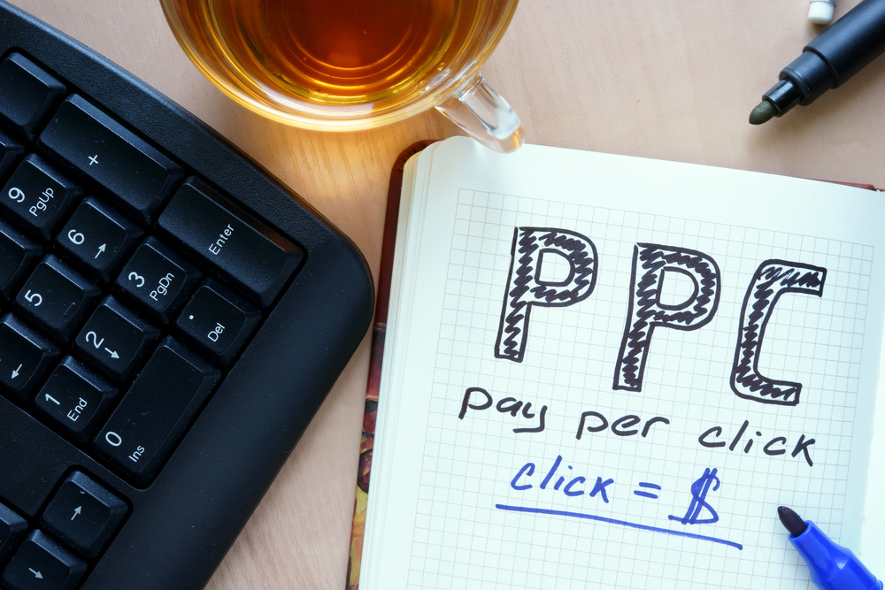
How AI Will Shape PPC Advertising in 2024 and Beyond
As we speed through 2024, we keep witnessing a monumental transformation in Pay-Per-Click (PPC) advertising. This shift signifies a critical departure from conventional methodologies, steering towards a more sophisticated and intelligent paradigm. The driving force behind this profound shift? Artificial Intelligence (AI). AI isn’t just altering the mechanics of PPC; it’s redefining its very essence, integrating unprecedented levels of precision, efficiency, and effectiveness into advertising campaigns. This evolution reflects a broader trend in digital marketing, where innovation and adaptability are key to

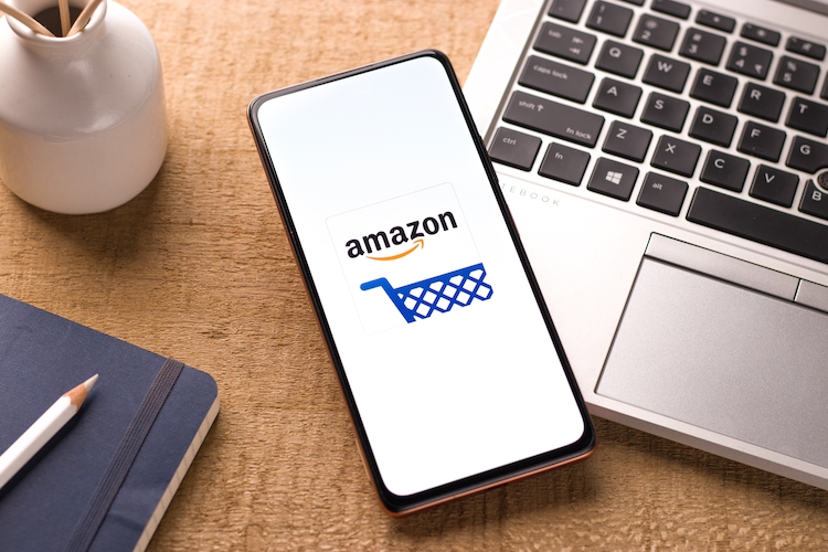
Maximize Your Business Potential with Amazon Bids and Budgets
In today’s competitive market, visibility is key to driving sales and ensuring the success of your business. With millions of shoppers using Amazon daily, the platform provides a valuable opportunity

7 Content Marketing Trends to Follow in 2024
Everyone has a story to tell, even in the marketing field. That is why content creation is the key to opening the horizons of endless opportunities and achieving high goals.

How to Use Social Media to Outplay Your Competition & Win New Customers
It’s common knowledge that social media holds a significant chunk of our daily routines nationwide. The typical American adult invests roughly 2 hours and 25 minutes per day on various
Mastering Google 5-Star Ratings for Multi-Location Restaurants
Unlock the secrets to achieving Google 5-star ratings for your multi-location restaurant! Google Business Profile gives multi-location restaurants all the tools to succeed at every location. Create a free profile
Social Media Trends to Watch Out For in 2024!
Greetings, social media enthusiasts and marketers! As we dive into 2024, it’s crucial to stay ahead of the competition in the dynamic social media marketing landscape. With platforms like Snapchat
Boosting Sales & Brand Visibility with Amazon Sponsored Display Ads
Amidst the dynamic landscape of digital marketing, Amazon Sponsored Display Ads continue to emerge as a powerful force for individuals such as sellers, vendors, and agencies seeking to elevate their
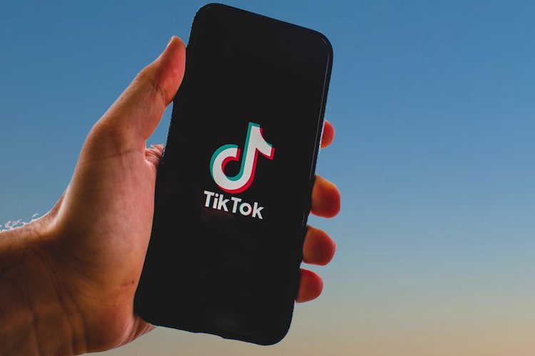
Expert Strategies for Business Growth on TikTok
Hey there, trendsetters! Welcome to the dazzling world of TikTok, the digital playground that’s rewriting the rules of social media engagement! Consider this: over a billion people, from energetic teens

Revolutionizing Email Marketing Through Artificial Intelligence
Amidst the dynamic terrain of digital marketing, email stands as a resilient conduit for businesses to connect with their audience. Yet, the conventional strategy of deploying generic, one-size-fits-all email campaigns
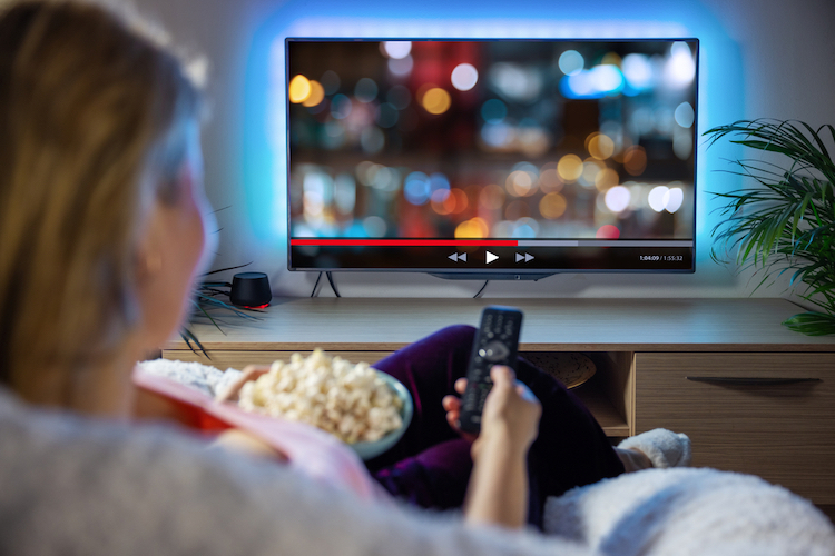
A Quick Look into Amazon Streaming TV Ads
Picture an advertisement for your business, in the commercial breaks of prime-time Thursday night football. Such a scenario sounds like a dream to any company, as entertainment from the gridiron
Amazon’s Branded Tailored Audiences: Redefining Email Marketing for Sellers
In 1978, Digital Equipment Corporation sent out the first mass marketing email to 400 potential clients, resulting in $13 million in sales. For the past 45 years, inboxes all over

How to Boost Traffic, Revenue, and Reputation Using FAQ Pages
Given the dynamic nature of digital marketing, staying ahead of SEO (Search Engine Optimization) trends is crucial. With Google’s recent helpful content update, the game has changed, steering towards more

Amazon Verified Agency Partners: Elevating Your Advertising Success
Step into the dynamic realm of Amazon Ads Partner Network, where expertise and innovation thrive to propel businesses to new heights in the competitive Amazon advertising landscape. In this comprehensive