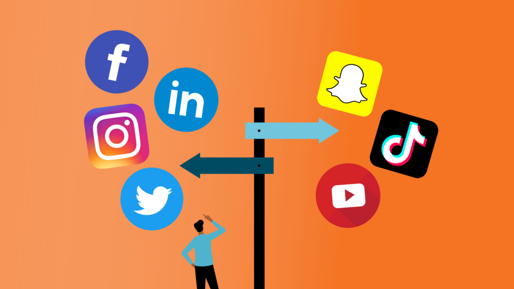
2025 Social Media Playbook: Trends, Strategies, and Winning Moves
Dive into Premiere Creative’s social media playbook. In 2025, the social media landscape is undergoing significant transformations, presenting both challenges and opportunities for marketers. Drawing insights from HubSpot’s recent reports and industry analyses, this comprehensive guide delves into the top trends shaping social media marketing this year and offers actionable strategies to stay ahead. Top Social Media Trends in 2025 Social media never stands still—and 2025 brings some of the most exciting changes yet. Let’s break down the key trends that are
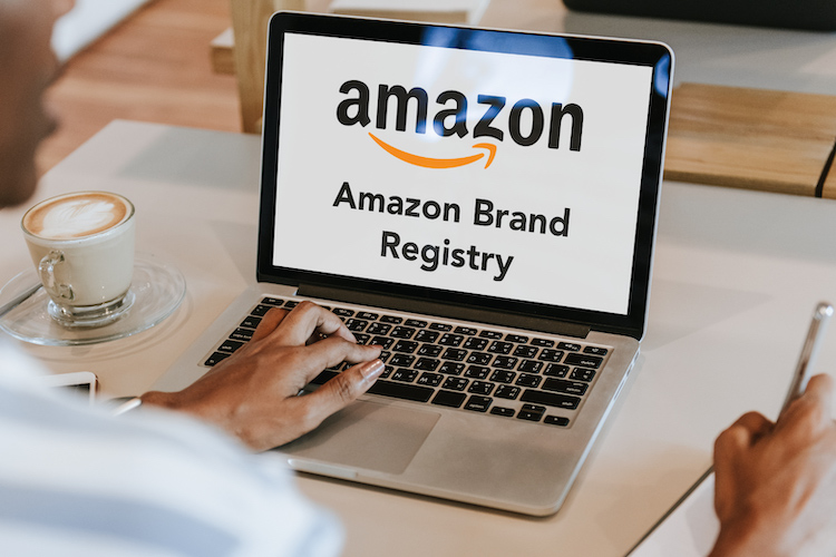
Revoked Amazon Brand Registry? Here’s What Caused It—And How to Recover
For Amazon sellers, enrolling in the Brand Registry program is a powerful way to protect intellectual property, enhance listings, and elevate a brand’s visibility. But what if your Amazon Brand
Disruptive Storytelling in Marketing: The Power of Human Connection in 2025
AI has reshaped industry norms, but human connection remains the heartbeat of effective marketing. From writers to designers, creative professionals feel the pressure of automation and algorithm-driven content. While AI
5 Reasons Your Site Was Deindexed from Google—and How to Fix It!
Imagine waking up to discover your website has vanished from Google’s search results. Traffic drops to zero. Leads stop coming in. Panic sets in. For many website owners, getting deindexed

3 Key Methods to Rank Higher for AI Visibility
Ranking on Google’s first page SERP results just got a whole lot tougher thanks to AI. With AI reshaping the search landscape, Google now favors the top three results, squeezing
The Importance of Maintaining SEO for Organic Visibility
More than just a growth driver, organic SEO acts as your business’s first line of defense against the emergence of Artificial Intelligence (AI). As AI continues to evolve, achieving organic

Why In-Stream Video Ads Are Dominating in 2025
In today’s fast-scrolling, content-saturated world, one ad format continues to dominate attention: video. But simply pressing play simply isn’t enough—in-stream video ads deliver the impact brands need to cut through

Think Email Is Dying? Think Again. Here’s Why Email Remains the Backbone of Digital Marketing
In a world dominated by social media, instant messaging, and AI-powered technology, email continues to be resilient, reliable, and remarkably effective. Since the first message sent in 1971, email has

New Study Reveals AI-Powered Search Engines are ‘Flawed Answer Machines’
AI-powered search engines like ChatGPT and Google’s AI Overviews continue to revolutionize how we access information—but at what cost? As reliance on artificial intelligence grows, so does the risk of

3 Lessons to Grow Your Instagram Account in 2025
Instagram may have started as a way to connect with friends—today, marketers use the growing hub for business activity. From shoppable posts to embedded product links, Instagram has transformed how

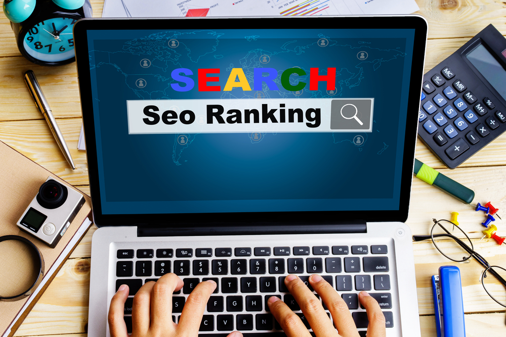
Is SEO Dead? Not Even Close—Here’s Why It Still Matters in 2025
Watch digital marketing headlines long enough and you’ll spot the usual suspects—“SEO is dead!” Bold claims like that flood the internet, chasing clicks. But let’s set the record straight. Search
Mastering Reddit Marketing: A Guide to Building Authentic Connections and Trust
What if there was a social platform where people actually prefer honest conversations over ads? Welcome to Reddit. Reddit is more than just a social media platform—it’s a vast network
Key Strategies for Marketplace Sellers to Grow with Walmart Fulfillment Services
In today’s competitive eCommerce landscape, choosing the right fulfillment partner can make or break an online business. Luckily, Walmart Fulfillment Services (WFS) has emerged as a powerful tool, particularly for