Marketers can easily build landing pages these days, especially with all the digital tools available. But creating a landing page is only half the battle; the true challenge lies in creating a landing page that actually converts. Why? Because you need to consider the various elements on the page such as your design, your brand’s message, and the copy will affect each visitor.
So how exactly do you optimize your landing pages to convert visitors and achieve your sales goals? While landing pages don’t follow a set formula, several rules of thumb will help increase your chances of creating a page that meets and exceeds your goals.
1) Reduced Navigation
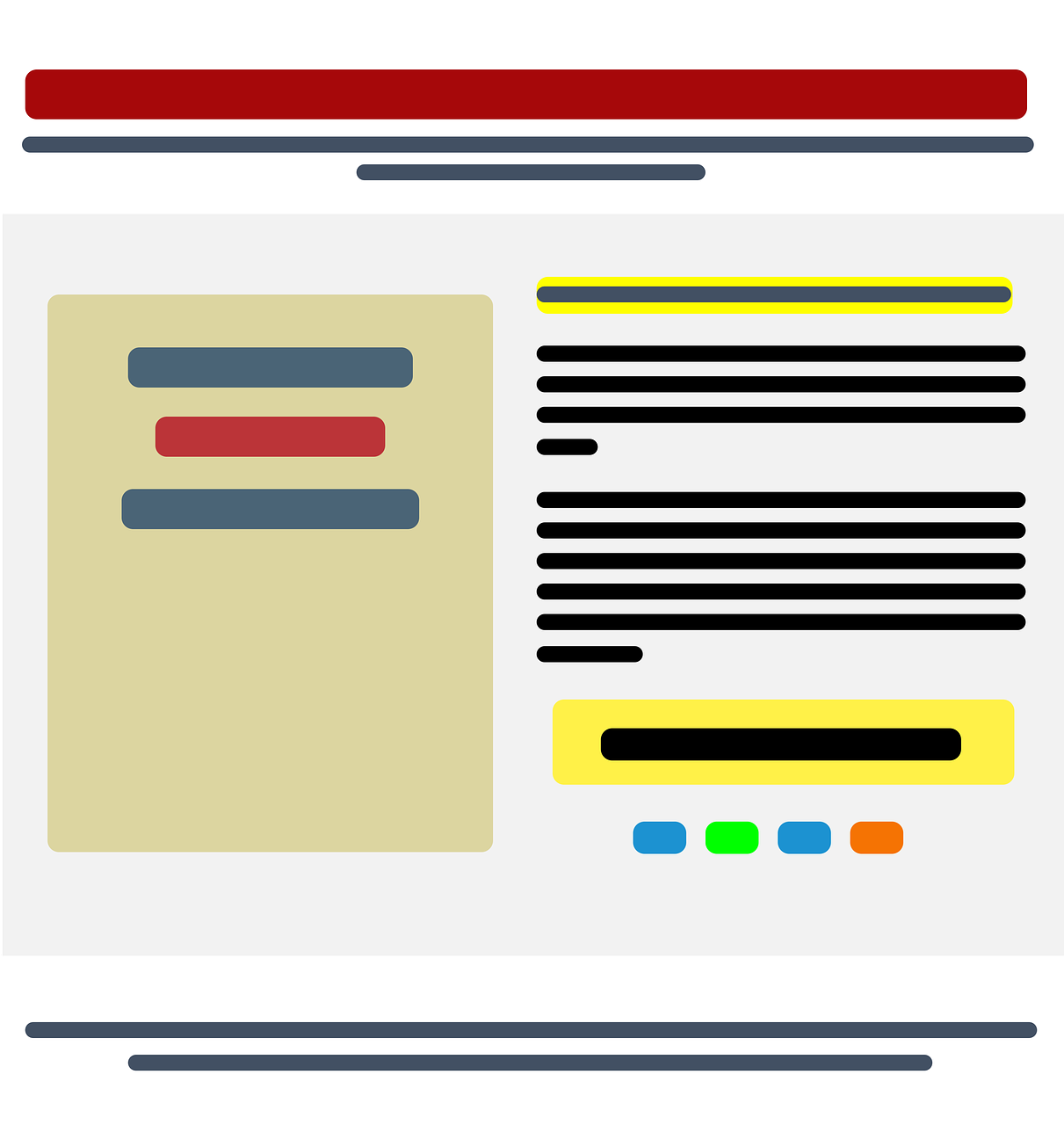
During the design process, you need to remember that these visitors landed on your website to receive your promoted offer. By removing the distractions, you’re helping them receive the offer quicker. Once visitors land on your page, you don’t want them to leave until they submit their information and receive your offer. Thus, you need to keep your navigation options to a minimum so they don’t wander off to other pages without completing your intended action. For instance, be sure to remove top and side navigation bars from the page so that nothing distracts your prospects from completing the form. Furthermore, avoid including hyperlinks within your page’s copy to ancillary pages.
2) Clear, Concise Headline and Subheading
When visitors land on your page, the headline grabs their attention first. Believe it or not, a boring headline can deter your potential customers from taking action. The more enticing information you provide in the headline, the more likely you’ll convert interested prospects. Therefore, you will want to develop a concise headline that clearly states your offer. For example, your headline could tell visitors what kind of eBook they’re signing up for, or what product you’re launching. Meanwhile, including a subheading under your main headline can provide additional information about the benefits of your offer. You can’t always fit enough information in a headline, but a subheading gives you a chance to extrapolate more information.
3) Compelling Copy
While a headline and subheading give visitors a general idea about your great offer, those won’t always close the deal. Thus you will need to craft copy to motivate them to fill in their contact information on the form. A few sentences clearly stating the offer and its value can further entice visitors to submit their information.
Be sure that you break up a large block of text and use bullet points to draw eyes to the most important takeaways. While writing your landing page’s copy, try to anticipate and answer any questions visitors might have about your offer.
4) Relevant Images
A picture says a thousand words, and a great image may strike an emotional chord with your visitor. If you plan on using an image on your landing page, that image should be relevant to your offer to avoid confusing buyers. A beautiful image will resonate with a visitor longer than any copy because they’ll be able to match something visual to the text they read.
5) Lead Capture Form
The lead capture form is the most important element of your landing page. Without this form, you cannot collect the necessary data that helps you market to potential buyers.You may find yourself tempted to ask for lots of information from visitors in order to learn how to best market to them. Visitors, however, want to spend as little time as possible filling out a form to gain access to your offer. Thus, the number of fields on your form should be a compromise between user experience and business needs.
6) Privacy Policy
While many digital marketers may consider this element optional, you should always include a privacy policy any time you request information from a website visitor. Unfortunately, many companies sell people’s information to the highest bidder. So you should provide a brief explanation on how you plan to use people’s contact information. You should provide an explanation of how you plan to use email addresses and phone numbers. After all, a lack of a privacy policy could discourage visitors from filling out your form. Simply put, including a privacy policy will give your prospects peace of mind that their contact information will remain safe.
7) Persuasive Button Copy of CTAs
A strong call-to-action (CTA) or copy in your button is can motivate and encourage visitors to perform the desired action on your landing page. You should avoid generic words such as “Submit” as you don’t want vague CTAs. Instead, excite your buyers by telling them exactly what they will receive when they click on that button. Use phrases like “Download Now,” “Download Your Free Webinar,” or “Access Your Coupon.”
How Will You Design YOUR Landing Page?
Different landing page elements will produce different outcomes for different businesses. Thus, a “perfect” landing page is subjective. A good landing page meets your business objectives with the highest amount of quality conversions possible. Therefore, you need to perform A/B tests to determine which landing page yields the best results. To learn more about successful landing pages, contact the digital experts at Premiere Creative today or give us a call at (973) 346-8100.

