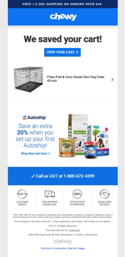
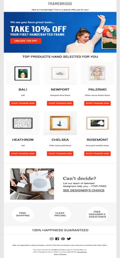
One of the biggest struggles for all Direct-to-Consumer brands (DTC) is that 98% of your traffic fails to transact. Most companies focus too much time on their social media marketing, product development, and ad campaigns but ignore the low hanging fruit sitting in front of them. In an ideal world, consumers would visit your website, find a product(s), add it to their cart, and proceed to checkout. Once you have your visitor’s email address, running a browse abandonment automation series through email software like Klavyo allows you to serve up emails to move the visitor closer to checkout.
What is a Browse Abandonment Email?
The browse abandonment email is an automatic email sent to subscribers based on their activity on the website when they browse product-level pages but do not complete an order. A browse abandonment email is similar to a cart abandonment email in that both rely on a user’s behavioral cues. The difference is that with the browse abandonment email, the user is further away from the point of conversion, meaning that they’ve shown interest in a particular product but have not placed anything in their cart. But you can still target such users based on their specific page view with a relevant follow-up email: the idea being to convert them by showcasing what they already gravitate towards.
Depending on the scope of your email campaign, you may have multiple browse abandonment emails in your flow. Having managed email campaigns for several prominent eCommerce fashion brands, Premiere Creative’s email experts typically recommend at least two browse abandonment emails.
The Browse Abandonment Email #1
You’ll send out emails to people who have been browsing the website. More specifically, you can send this email out at least 2 hours after they have abandoned their browsing session. It’s essentially a reminder of the last product they looked at, with some copy written about it, and a call-to-action that takes them back to the same page using the product name/image/link. To encourage more clicks, you can also have a product recommendations row.

Examples of appropriate subject lines include:
- “Did you see something you like?”
- “We saw you checking us out!”
- “Recommended just for you!”
Basically, you’ll want to stick to clear and simple subject lines with 40 characters or less. The subject lines should be generic enough to apply to any viewed product and/or include the product name dynamically. This will ensure that you easily capture the user’s attention and remind them of the abandoned site.
The Browse Abandonment Email #2
The browse abandonment #2 email is an automated email that gets sent 20 hours to 2 days after they have received the browse abandonment #1 email and ONLY if they still haven’t placed an order.

This email acts as a reminder since it is sent after the subscriber has received the browse abandonment #1 email. The email should remind the user of the product they viewed and, once again, should encourage the subscriber to place their order.
Examples of strong email subject lines include:
- “Don’t forget your [product]!”
- “10% off your next order!”
- “Still deciding? Check our [products] out!
Furthermore, an optional small incentive (5-10% off or free shipping) can be included to further entice the user to go ahead and purchase the product they initially liked. This extra incentive can help encourage your customers to transact.
Designs for Browse Abandonment Emails
When building Browse Abandonment emails, the layout for all emails should contain a main hero image, a suggested items section, and a dynamic block featuring the viewed product (with the image, name, pricing, and a call-to-action).
To help simplify the construction process, make sure to follow these requirements for the design assets:
- Main Hero Image: the imagery should incorporate a great lifestyle image accompanied by the copy and a strong call-to-action. Make sure your call-to-action has simple language like “Shop Now,” or “View Product.” You should also ensure that the images you use correspond to the following measurements:
- Image Width: 640px
- Image Height: 400-640px
- Recommended Products Section: this comes below the dynamic product. You can structure your grid as one row of three products or two rows of three products. Make sure the photos you’re using are the right size for the job:
- Image Width: 640px
- Image Height: 400-740px
Re-Engage & Drive Conversions with Browse Abandonment Automations
Browse abandonment emails sent automatically help DTC eCommerce businesses re-engage with the huge pool of their window shoppers, enticing them back to the eCommerce store to potentially reclaim those lost conversions. Creating these email automations may seem daunting, but businesses can see higher levels of success with support from a trusted Email Marketing Agency. Contact the experts at Premiere Creative today by dialing (973) 346-8100 to discuss launching your next email campaign!

